


Table of Contents » Chapter 4 : Output : Data Visualization
Data Visualization
Data Visualization is the graphical representation of information and data. By using visual elements like charts, graphs, and maps, data visualization tools provide an accessible way to see and understand trends, outliers, and patterns in data. In Python programming, numerous libraries make the process of visualizing data straightforward and effective. This section introduces you to the fundamental concepts of data visualization, discuss why it is important, and explore how you can use Python to create your visual representations.
- Quick Insight: Visualizations make it easier to identify patterns, relationships, and anomalies in large datasets.
- Storytelling: Data visualizations can tell a story by highlighting key facts and trends in the data, making it more engaging and understandable to a non-technical audience.
- Decision Making: Visual data representation helps stakeholders make informed decisions by presenting the data in a more digestible and accessible form.
- Line Graphs: Useful for displaying changes over time.
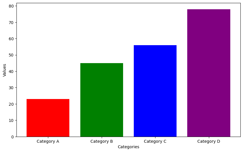
- Bar Charts: Ideal for comparing quantities across different categories.
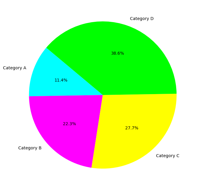
- Pie Charts: Best suited for showing a part-to-whole relationship.
- Scatter Plots: Excellent for identifying the relationship between two variables.
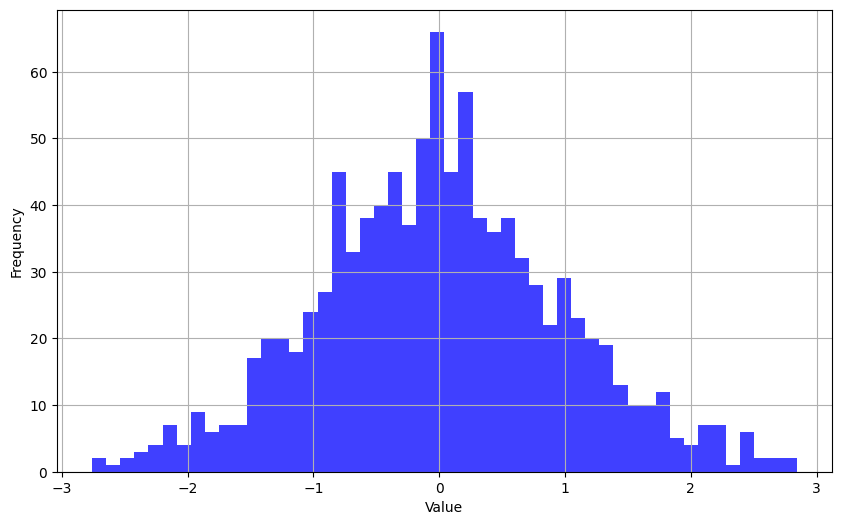
- Histograms: Used for showing the distribution of a dataset.
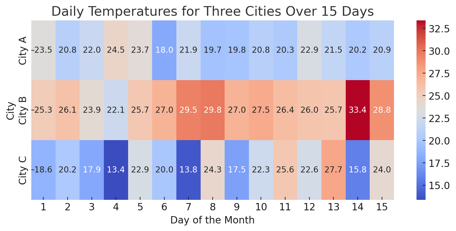
- Heatmaps: Great for representing the magnitude of a phenomenon as color in two dimensions.
- Understand Your Audience: Tailor your visualization to the knowledge level and interests of your audience.
- Keep It Simple: Don't overload your visuals with too much information. Focus on clarity.
- Use Color Wisely: Colors should enhance the message, not distract from it. Be mindful of color blindness.
- Label Appropriately: Ensure all axes, lines, or categories are clearly labeled.
- Tell a Story: Your visualization should convey a clear message or insight.
Python offers a wide range of data visualization libraries, catering to various needs from simple plots to advanced interactive visualizations. Here's an overview of some of the most popular and widely used data visualization libraries in Python:
- Altair: Declarative statistical visualization library for Python. Altair offers a powerful and concise visualization grammar that enables you to build a wide range of statistical visualizations easily. Use Cases: Exploratory data analysis with a concise syntax, interactive visualizations. Website & Documentation: altair-viz.github.io
- Bokeh: A library for creating interactive and scalable visualizations in modern web browsers. Bokeh can output its plots as JSON objects, HTML documents, or interactive web applications. Use Cases: Interactive plotting and dashboards, real-time data streams, web applications. Website & Documentation: boken.org
- Dash: A framework for building analytical web applications. No JavaScript required. Dash is built on top of Plotly.js and React.js, offering a Pythonic way to build rich web applications. Use Cases: Web applications for Python data visualization, interactive dashboarding. Website & Documentation: dash.plotly.com
- ggplot: Based on The Grammar of Graphics, ggplot (part of the plotnine package) is a Python implementation of R's ggplot2, offering a declarative approach to plotting. Use Cases: Complex multi-plot layouts, building plots layer by layer, statistical plots. Website & Documentation: pypi.org/project/ggplot
- Holoviews: Designed for building complex visualizations easily. It works with Bokeh and Matplotlib backends to render interactive and static visualizations, respectively. Use Cases: High-level building of complex visualizations, exploratory data analysis with minimal coding. Website & Documentation: holoviews.org
- Matplotlib: Matplotlib is a comprehensive library for creating static, animated, and interactive visualizations in Python.. Website & Documentation: matplotlib.org
- Numpy: NumPy is a fundamental package for scientific computing in Python, providing support for large, multi-dimensional arrays and matrices, along with a collection of mathematical functions to operate on these arrays. Website & Documentation: numpy.org
- Pandas: Pandas is an open-source data analysis and manipulation tool for Python, offering data structures and operations for manipulating numerical tables and time series. Website & Documentation: pandas.pydata.org
- Plotly: Plotly is a graphing library that makes interactive, publication-quality graphs online. It offers support for multiple programming languages, including Python. Use Cases: Interactive and web-based plots (3D charts, line charts, area charts, scatter plots, etc.), dashboards, and applications. Website & Documentation: plotly.com
- Pygal: A dynamic SVG charting library. Pygal stands out by generating interactive SVG (Scalable Vector Graphics) images that can be embedded in web pages. Use Cases: Creating SVG plots for web applications, interactive charts. Website & Documentation: pygal.org
- Seaborn: Seaborn is a Python data visualization library based on Matplotlib that provides a high-level interface for drawing attractive and informative statistical graphics.. Website & Documentation: seaborn.pydata.org
Each of these libraries has its strengths and is suited to different types of data visualization tasks, from simple plots to complex interactive web applications. The choice of library often depends on the specific requirements of the project, such as the complexity of the visualization, the need for interactivity, and the target audience (web, publication, exploratory analysis, etc.).
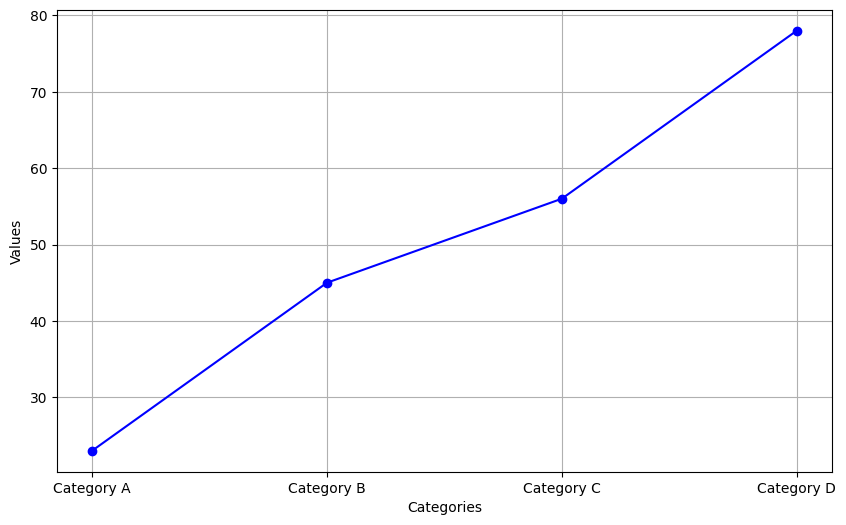
A line graph is a type of chart used to display information as a series of data points connected by straight line segments. It is a fundamental tool in data visualization that is effective at showing trends over time or categories. Line graphs are particularly useful for illustrating the change of one or more variables, allowing viewers to see patterns, progress, or fluctuations within the data. They are favored for their clarity and simplicity, making it easy to compare multiple data sets or to track changes across different periods or groups. One might use a line graph to analyze business trends, such as sales revenue or customer growth over months or years, to forecast future performance, or to identify patterns that could inform strategic decisions. By visually representing data in a line graph, complex information becomes more accessible, enabling a straightforward interpretation of temporal relationships, trends, and potential outliers within the dataset.
Note: We'll use the matplotlib library for the line graph examples below. You can find full documentation on this library here.
Simple Line Graph Example
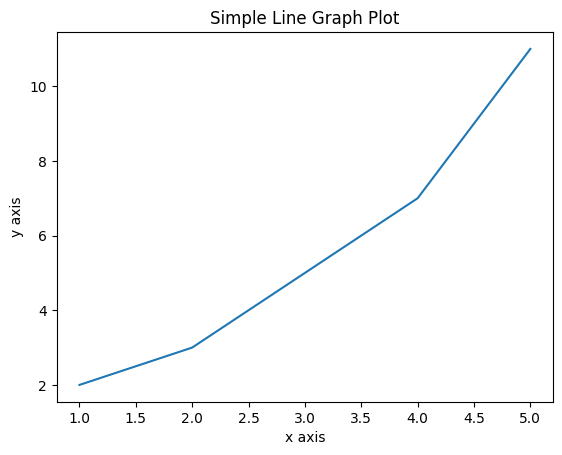
This example uses the matplotlib library to create a simple line graph of some data points. Read the code carefully, especially the comments, as a guide to how this program works.
Code
# First import the matplotlib library
import matplotlib.pyplot as plt

# Create some simple data to use with this example
# The values in the two lists can be any numeric values
x = [1, 2, 3, 4, 5]
y = [2, 3, 5, 7, 11]

# Create a figure (container for the visualization) and axis (the x & y axis of the plot) for the plot
fig, ax = plt.subplots()

# Use the plot method to create a plot of the data
ax.plot(x, y)

# Set attributes of the plot for readability
ax.set_title('Simple Line Graph Plot')
ax.set_xlabel('x axis')
ax.set_ylabel('y axis')

# Show the plot
plt.show()
Output
Figure 1. shows the output of the above code. Study the code, the comments in the code, and the output graph, pay particular attention how the elements of the code results in aspects of the graph.
Expand the Line Graph Example
Now let's copy the code above and make a few modifications to explore the ideas further. In this version, we'll add values to the dataset with the recommendation of trying different values, and rerunning the program to explore how the values alter the appearance of the graph. Also, we'll add markers to the graph so that the data points are more prominent on the graph. This is an example of using parameters of the plot() method to control the appearance of the graph. See the full documentation of the matplotlib.pyplot.plot method here for additional details.
Code
# First import the matplotlib library
import matplotlib.pyplot as plt

# In this example, we've added more values with more variability
# To experiment with the line graph, change a few values and
# re-run this program to see the changes.
x = [1, 2, 3, 4, 5, 6, 7, 8, 9, 10, 11, 12, 13, 14, 15, 16, 17, 18, 19, 20]
y = [2, 20, 17, 12, 11, 13, 14, 9, 17, 19, 21, 31, 29 ,28, 32, 27, 28, 30, 31, 35]

# Create a figure (container for the visualization) and axis (the x & y axis of the plot) for the plot
fig, ax = plt.subplots()

# Use the plot method to create a plot of the data
# In this example, we've added the "marker='o'" attribute
# to demonstrate how we can adjust visual aspects of
# the graph with additional parameters in the call to
# the plot() method.
ax.plot(x, y, marker='o')

# Set attributes of the plot for readability
ax.set_title('Simple Line Graph Plot')
ax.set_xlabel('x axis')
ax.set_ylabel('y axis')

# Show the plot
plt.show()
Output
Figure 1. shows the output of the above code. Study the code, the comments in the code, and the output graph, pay particular attention how the elements of the code results in aspects of the graph.
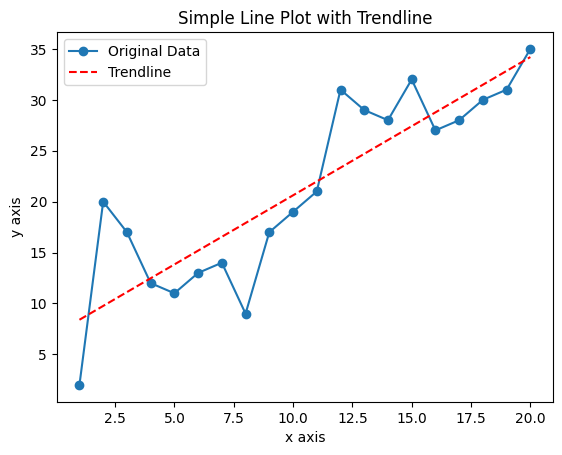
Adding a Trend Line to the Line Graph Example
Next we'll add a trend line to the line graph to help us see the underlying trend in the dataset.
Code
# In addition to the matplotlib library we also need the numpy library
# which we'll use to produce the trendline based on calculations provided
# by the numpy library
import matplotlib.pyplot as plt
import numpy as np

# In this example, we've added more values with more variability
# To experiment with the line graph, change a few values and
# re-run this program to see the changes.
x = [1, 2, 3, 4, 5, 6, 7, 8, 9, 10, 11, 12, 13, 14, 15, 16, 17, 18, 19, 20]
y = [2, 20, 17, 12, 11, 13, 14, 9, 17, 19, 21, 31, 29 ,28, 32, 27, 28, 30, 31, 35]

# Use the plot method to create a plot of the dataset above. In addition to the
# "marker='o'" attribute that we included in the previous example, now we're
# also adding a label as well to provide a legend of two different lines that
# will appear on the output graph
plt.plot(x, y, marker="o", label='Original Data')

# Next we'll use the numpy library to calculate the trendline. At this point
# you don't need to understand the mathematics behind it, but numpy uses
# concepts called linear regression and polynomials to calculate the trend line
# and then we will add it to the graph. In the z calculation below, the 1 indicates
# a first-degree polynomial (linear) fit. If we change it to 2 or higher, the "fit"
# will approach closer and closer to the plot of the dataset itself.
z = np.polyfit(x, y, 1)
p = np.poly1d(z)

# Now we can plot the trendline, including another label to add to the output legend
plt.plot(x, p(x), "r--", label='Trendline')

# Set attributes of the plot for readability
plt.title('Simple Line Plot with Trendline')
plt.xlabel('x axis')
plt.ylabel('y axis')

# Show the legend
plt.legend()

# Display the plot
plt.show()
Output
Figure 3. shows the output of the above code. Study the code, the comments in the code, and the output graph, pay particular attention how the elements of the code results in aspects of the graph.
Experimentation
Once you have the code above working, you can experiment with this graph to learn a bit more about how it operates by altering the dataset values (Code Lines 11 & 12) and also the "fit" value (Code Line 26) by changing it to a number larger than 1, and then re-run the code to see the changes in the line graph.
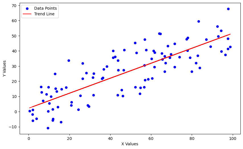
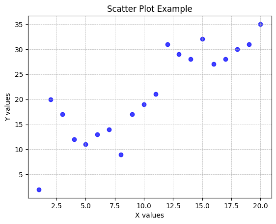
Another common graphing tools is called scatter plots, which are a type of data visualization that display values for typically two variables for a set of data on a Cartesian coordinate system. Points on the plot represent the values of individual data points. This kind of plot is particularly useful for examining the relationship between two numerical variables, allowing viewers to detect any correlations, trends, clusters, or outliers within the data. Analysts and researchers often use scatter plots to explore hypotheses about causal relationships or to investigate the distribution and grouping of data points in a more exploratory phase of analysis. For instance, in the field of healthcare, scatter plots can be employed to study the relationship between patients' age and their response to a particular treatment. The intuitive and straightforward nature of scatter plots makes them an invaluable tool for initial data analysis, helping to uncover underlying patterns or relationships that might warrant further investigation or statistical analysis.
Simple Scatter Plot Example
This example uses the matplotlib library to create a simple scatter plot of some data points. Read the code carefully, especially the comments, as a guide to how this program works.
Code
# First import the matplotlib library
import matplotlib.pyplot as plt

# We'll continue using this dataset that we constructed for the line graphs above
x = [1, 2, 3, 4, 5, 6, 7, 8, 9, 10, 11, 12, 13, 14, 15, 16, 17, 18, 19, 20]
y = [2, 20, 17, 12, 11, 13, 14, 9, 17, 19, 21, 31, 29 ,28, 32, 27, 28, 30, 31, 35]

# Next, we'll use matplotlib to create a scatter plot. Notice the use of the
# parameters to set up the appearance of the plot
plt.scatter(x, y, c='blue', marker='o', edgecolor='blue', linewidth=1, alpha=0.75)

# Set attributes of the plot for readability
plt.title('Scatter Plot Example')
plt.xlabel('X values')
plt.ylabel('Y values')

# Optional: Adding a grid for better readability
plt.grid(True, which='both', linestyle='--', linewidth=0.5)

# Show the plot
plt.show()
Output
Figure 4. shows the output of the above code. Study the code, the comments in the code, and the output graph, pay particular attention how the elements of the code results in aspects of the graph.
Adding a Trend Line to the Scatter Plot Example
Next we'll add a trend line to the scatter plot to help us see the underlying trend in the dataset.
Code
import matplotlib.pyplot as plt
import numpy as np  # Import NumPy for numerical calculations

# Dataset
x = np.array([1, 2, 3, 4, 5, 6, 7, 8, 9, 10, 11, 12, 13, 14, 15, 16, 17, 18, 19, 20])
y = np.array([2, 20, 17, 12, 11, 13, 14, 9, 17, 19, 21, 31, 29 ,28, 32, 27, 28, 30, 31, 35])

# Creating a scatter plot
plt.scatter(x, y, c='blue', marker='o', edgecolor='black', linewidth=1, alpha=0.75, label='Data Points')

# Calculate coefficients for the trend line (linear regression)
m, b = np.polyfit(x, y, 1)

# Add the trend line to the plot
plt.plot(x, m*x + b, color='red', linewidth=1, label='Trend Line')

# Adding titles and labels
plt.title('Scatter Plot with Trend Line')
plt.xlabel('X values')
plt.ylabel('Y values')

# Optional: Adding a grid for better readability
plt.grid(True, which='both', linestyle='--', linewidth=0.5)

# Adding legend to the plot to identify the trend line
plt.legend()

# Show the plot
plt.show()
Output
Figure 5. shows the output of the above code. Study the code, the comments in the code, and the output graph, pay particular attention how the elements of the code results in aspects of the graph.
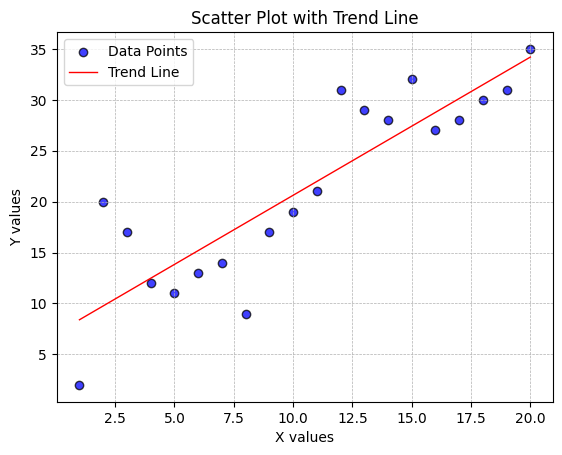
Experimentation
Once you have the code above working, you can experiment with this plot to learn a bit more about how it operates by altering dataset values, and then re-run the code to see the changes in the plot.
In Chapter 3 we discussed Datasets which included a tabular dataset of high and low temperature data for the month of November, 2023 in Salt Lake City. That dataset is tabular and is represented in the Chapter 3 examples as a list of lists, like this:
data = [
    ["2023-11-01", 58, 32], ["2023-11-02", 64, 35], ["2023-11-03", 67, 44],
    ["2023-11-04", 67, 41], ["2023-11-05", 65, 45], ["2023-11-06", 71, 48],
    ["2023-11-07", 52, 38], ["2023-11-08", 49, 34], ["2023-11-09", 49, 31],
    ["2023-11-10", 53, 31], ["2023-11-11", 54, 31], ["2023-11-12", 63, 33],
    ["2023-11-13", 66, 42], ["2023-11-14", 66, 38], ["2023-11-15", 68, 44],
    ["2023-11-16", 59, 41], ["2023-11-17", 58, 36], ["2023-11-18", 52, 39],
    ["2023-11-19", 49, 35], ["2023-11-20", 46, 34], ["2023-11-21", 48, 30],
    ["2023-11-22", 49, 30], ["2023-11-23", 42, 32], ["2023-11-24", 36, 32],
    ["2023-11-25", 38, 29], ["2023-11-26", 36, 29], ["2023-11-27", 40, 25],
    ["2023-11-28", 41, 24], ["2023-11-29", 36, 25], ["2023-11-30", 34, 30]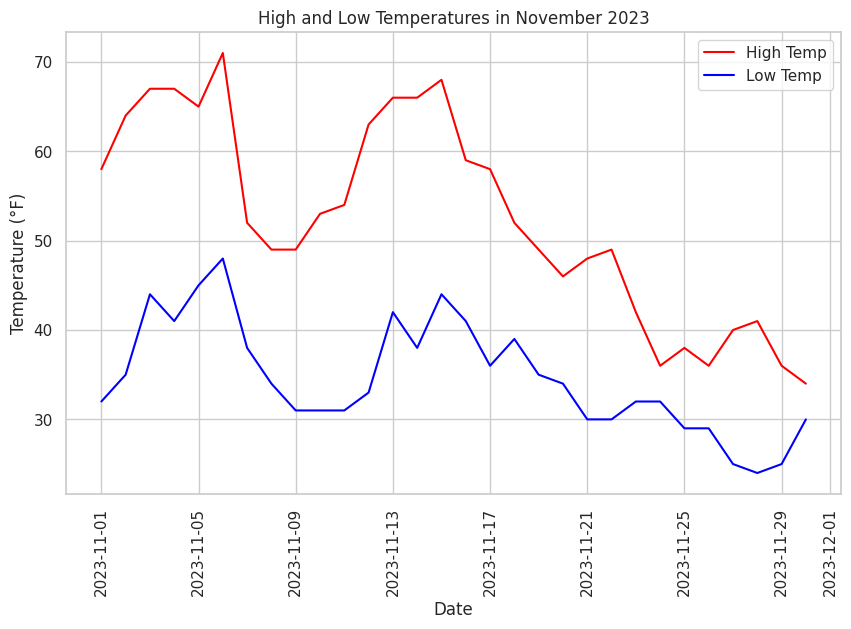
]When our dataset is tabular, the pandas Python library is a very good choice for managing that tabular data. In the following example, we'll use the temperature dataset along with pandas to produce a line graph and a scatter plot to demonstrate the use of the pandas library with tabular data and data visualization libraries.
Line Graph of Tabular Data
In the following example, we'll use the November 2023 Salt Lake City temperature dataset to produce a line graph of the tabular data.
Code
# In this example, we'll import the pandas, seaborn and matplotlib libraries
import pandas as pd
import seaborn as sns
import matplotlib.pyplot as plt

# Tabular dataset
data = [
    ["2023-11-01", 58, 32], ["2023-11-02", 64, 35], ["2023-11-03", 67, 44],
    ["2023-11-04", 67, 41], ["2023-11-05", 65, 45], ["2023-11-06", 71, 48],
    ["2023-11-07", 52, 38], ["2023-11-08", 49, 34], ["2023-11-09", 49, 31],
    ["2023-11-10", 53, 31], ["2023-11-11", 54, 31], ["2023-11-12", 63, 33],
    ["2023-11-13", 66, 42], ["2023-11-14", 66, 38], ["2023-11-15", 68, 44],
    ["2023-11-16", 59, 41], ["2023-11-17", 58, 36], ["2023-11-18", 52, 39],
    ["2023-11-19", 49, 35], ["2023-11-20", 46, 34], ["2023-11-21", 48, 30],
    ["2023-11-22", 49, 30], ["2023-11-23", 42, 32], ["2023-11-24", 36, 32],
    ["2023-11-25", 38, 29], ["2023-11-26", 36, 29], ["2023-11-27", 40, 25],
    ["2023-11-28", 41, 24], ["2023-11-29", 36, 25], ["2023-11-30", 34, 30]
]

# Convert the data to a pandas DataFrame
df = pd.DataFrame(data, columns=['Date', 'High Temp', 'Low Temp'])

# Convert (cast) the 'Date' column to datetime format
df['Date'] = pd.to_datetime(df['Date'])

# Create a line plot
sns.set_theme(style="whitegrid")  # Setting the theme
plt.figure(figsize=(10, 6))  # Adjusting the figure size

# Plotting both high and low temperatures as lines
sns.lineplot(x='Date', y='High Temp', data=df, color='red', label='High Temp')
sns.lineplot(x='Date', y='Low Temp', data=df, color='blue', label='Low Temp')

plt.title('High and Low Temperatures in November 2023')
plt.xlabel('Date')
plt.ylabel('Temperature (°F)')
plt.xticks(rotation=90)
plt.legend()

plt.show()
Output
Figure 6. shows the output of the above code. Study the code, the comments in the code, and the output graph, pay particular attention how the elements of the code results in aspects of the graph.
Experimentation
Once you have the code above working, you can experiment with this plot to learn a bit more about how it operates by altering dataset values, and then re-run the code to see the changes in the plot.
Adding Trend Lines to the Line Graph of Tabular Data
Next we'll add a trend lines to the line graph to help us see the underlying trend in the tabular dataset.
Code
# In this example, we'll import the pandas, seaborn and matplotlib libraries
import pandas as pd
import seaborn as sns
import matplotlib.pyplot as plt
import matplotlib.dates as mdates

# Tabular dataset
data = [
    ["2023-11-01", 58, 32], ["2023-11-02", 64, 35], ["2023-11-03", 67, 44],
    ["2023-11-04", 67, 41], ["2023-11-05", 65, 45], ["2023-11-06", 71, 48],
    ["2023-11-07", 52, 38], ["2023-11-08", 49, 34], ["2023-11-09", 49, 31],
    ["2023-11-10", 53, 31], ["2023-11-11", 54, 31], ["2023-11-12", 63, 33],
    ["2023-11-13", 66, 42], ["2023-11-14", 66, 38], ["2023-11-15", 68, 44],
    ["2023-11-16", 59, 41], ["2023-11-17", 58, 36], ["2023-11-18", 52, 39],
    ["2023-11-19", 49, 35], ["2023-11-20", 46, 34], ["2023-11-21", 48, 30],
    ["2023-11-22", 49, 30], ["2023-11-23", 42, 32], ["2023-11-24", 36, 32],
    ["2023-11-25", 38, 29], ["2023-11-26", 36, 29], ["2023-11-27", 40, 25],
    ["2023-11-28", 41, 24], ["2023-11-29", 36, 25], ["2023-11-30", 34, 30]
]

# Convert the data to a pandas DataFrame
df = pd.DataFrame(data, columns=['Date', 'High Temp', 'Low Temp'])

# Convert the 'Date' column to datetime format
df['Date'] = pd.to_datetime(df['Date'])

# Convert dates into a numeric format for regression
df['DateNum'] = mdates.date2num(df['Date'])

# Create a line plot
sns.set_theme(style="whitegrid")
plt.figure(figsize=(10, 6))

# Plotting both high and low temperatures as lines
sns.lineplot(x='Date', y='High Temp', data=df, color='red', label='High Temp')
sns.lineplot(x='Date', y='Low Temp', data=df, color='blue', label='Low Temp')

# Adding trend lines using regplot
# Note: regplot requires a scatterplot, but we can set scatter=False to only show the regression line
sns.regplot(x='DateNum', y='High Temp', data=df, color='red', scatter=False)
sns.regplot(x='DateNum', y='Low Temp', data=df, color='blue', scatter=False)

plt.title('High and Low Temperatures in November 2023 with Trend Lines')
plt.xlabel('Date')
plt.ylabel('Temperature (°F)')
plt.xticks(rotation=45)

# Convert the numeric x-ticks back to readable dates
locator = mdates.AutoDateLocator(minticks=3, maxticks=7)
formatter = mdates.ConciseDateFormatter(locator)
plt.gca().xaxis.set_major_locator(locator)
plt.gca().xaxis.set_major_formatter(formatter)

plt.legend()
plt.show()
Output
Figure 7. shows the output of the above code. Study the code, the comments in the code, and the output graph, pay particular attention how the elements of the code results in aspects of the graph.
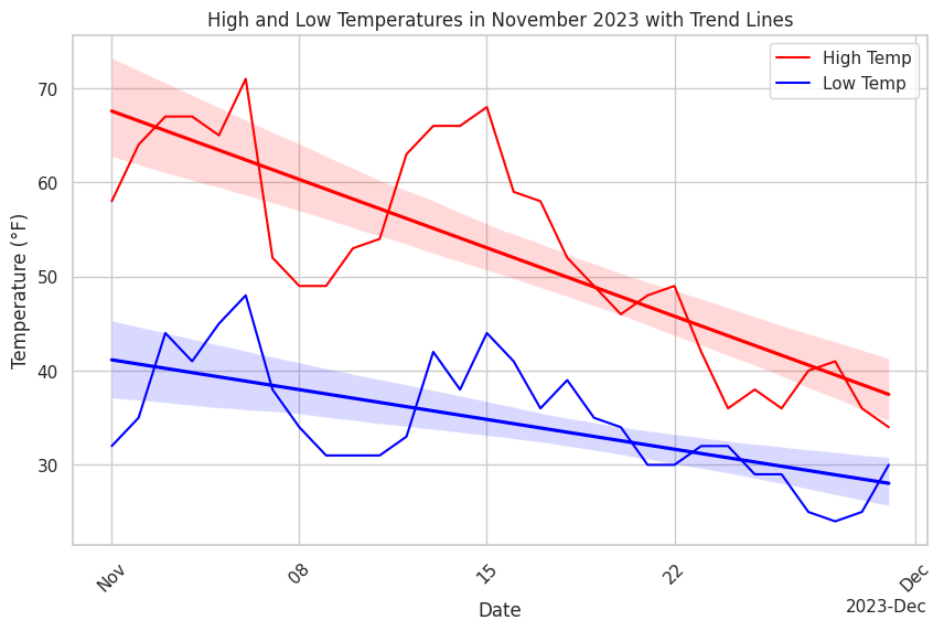
Experimentation
Once you have the code above working, you can experiment with this plot to learn a bit more about how it operates by altering dataset values, and then re-run the code to see the changes in the plot.
Scatter Plot of Tabular Data
Next we'll create a scatter plot of the tabular dataset.
Code
# In this example, we'll import the pandas, seaborn and matplotlib libraries
import pandas as pd
import seaborn as sns
import matplotlib.pyplot as plt

# Tabular dataset
data = [
    ["2023-11-01", 58, 32], ["2023-11-02", 64, 35], ["2023-11-03", 67, 44],
    ["2023-11-04", 67, 41], ["2023-11-05", 65, 45], ["2023-11-06", 71, 48],
    ["2023-11-07", 52, 38], ["2023-11-08", 49, 34], ["2023-11-09", 49, 31],
    ["2023-11-10", 53, 31], ["2023-11-11", 54, 31], ["2023-11-12", 63, 33],
    ["2023-11-13", 66, 42], ["2023-11-14", 66, 38], ["2023-11-15", 68, 44],
    ["2023-11-16", 59, 41], ["2023-11-17", 58, 36], ["2023-11-18", 52, 39],
    ["2023-11-19", 49, 35], ["2023-11-20", 46, 34], ["2023-11-21", 48, 30],
    ["2023-11-22", 49, 30], ["2023-11-23", 42, 32], ["2023-11-24", 36, 32],
    ["2023-11-25", 38, 29], ["2023-11-26", 36, 29], ["2023-11-27", 40, 25],
    ["2023-11-28", 41, 24], ["2023-11-29", 36, 25], ["2023-11-30", 34, 30]
]

# Convert the dataset to a pandas DataFrame
df = pd.DataFrame(data, columns=['Date', 'High Temp', 'Low Temp'])

# Convert (cast) the 'Date' column to datetime format
df['Date'] = pd.to_datetime(df['Date'])

# Create a scatter plot
sns.set_theme(style="whitegrid")  # Setting the theme
plt.figure(figsize=(10, 6))  # Adjust the figure size

# Plotting both high and low temperatures
sns.scatterplot(x='Date', y='High Temp', data=df, color='red', label='High Temp')
sns.scatterplot(x='Date', y='Low Temp', data=df, color='blue', label='Low Temp')

# Set titles and labels
plt.title('High and Low Temperatures in November 2023')
plt.xlabel('Date')
plt.ylabel('Temperature (°F)')
plt.xticks(rotation=90)
plt.legend()

plt.show()
Output
Figure 8. shows the output of the above code. Study the code, the comments in the code, and the output graph, pay particular attention how the elements of the code results in aspects of the graph.
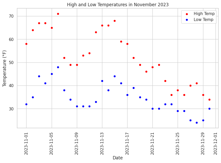
Experimentation
Once you have the code above working, you can experiment with this plot to learn a bit more about how it operates by altering dataset values, and then re-run the code to see the changes in the plot.